
Amateur designers tend to overdo their work. They cram every good idea they have into one design, leaving no area untouched. In their determination to not waste any space, they end up creating a noisy composition that buries the most important graphic elements. The result? Clutter, confusion, and chaos.
Fixing a sloppy work is simple in principle, although it’s not exactly easy to execute. As a graphic designer, all you need to do is maximize the use of an element called “white space,” which is a misnomer because it doesn’t necessarily refer to a white space. In fact, it can be any color, texture, or pattern, as long as it’s an unmarked area that makes the crucial points of a composition stand out.
White space is also known as “negative space” because it makes the “positive space” pop by shrinking in the background and remaining there unnoticed. Its general purpose is to provide a breather for the eyes so that viewers can easily scan a page and find what they need. Still, despite the crucial role that this element plays, it’s still overlooked and underrated at times.
Let’s give white space its own deserved spotlight. Let’s look at it not only from an aesthetic angle but also from a practical perspective. What do you say?
The Two Levels of White Space
There are two levels of white space according to density, ratio, proportion, and general purpose: macro and micro.
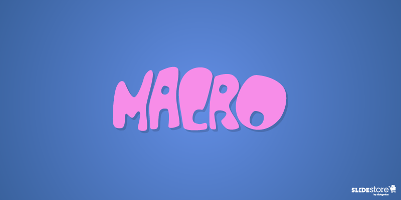
- Macro White Space. Obviously, macro white space is larger in volume compared to its counterpart. Plus, it’s easier to notice because it occupies the bigger portion of a given space. Its main purpose is to emphasize the focal points in a composition and give them structure, and its asymmetrical nature allows it to lend any work a more dynamic and candid look.
- Micro White Space. This refers to the white space that exists naturally between letters, words, lines, grid images, and other smaller graphic elements. Its main purpose is to direct the flow and order of the content to make for a legible and neat composition.
The Advantages of Using White Space
You’d think the advantages of using white space are obvious, but some presentation designers still overlook them. For good measure, go over them here again to fully internalize the importance of this presentation design element.
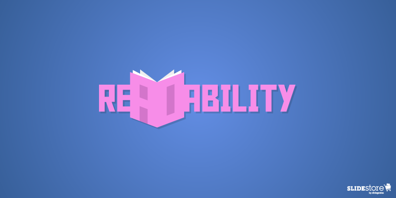
1. Improves readability and comprehension
The average attention span of a human being is not as long as it used to be, so if you want to attract and keep your viewers’ attention, you need to give them a good reason to stay. One way to do this is by making it easy for them to navigate through your content. Reduce clutter and design a slide in such a way that the viewers can easily find what they’re looking for. Aim for better comprehension and readability. When people have a full grasp of what you’re trying to communicate, they’re more likely to stay and find out what else you have in store for them.
2. Draws the eyes to the most important points
When used properly, white space can minimize distractions and draw the eyes to the presentation’s central points. The human brain tends to put emphasis on design elements surrounded by white space since they essentially cue the audience as to where they should be looking. When you use white space to lead users from one design element to another, you can sell your main points faster and more effectively.
3. Adds a sense of superiority to the design
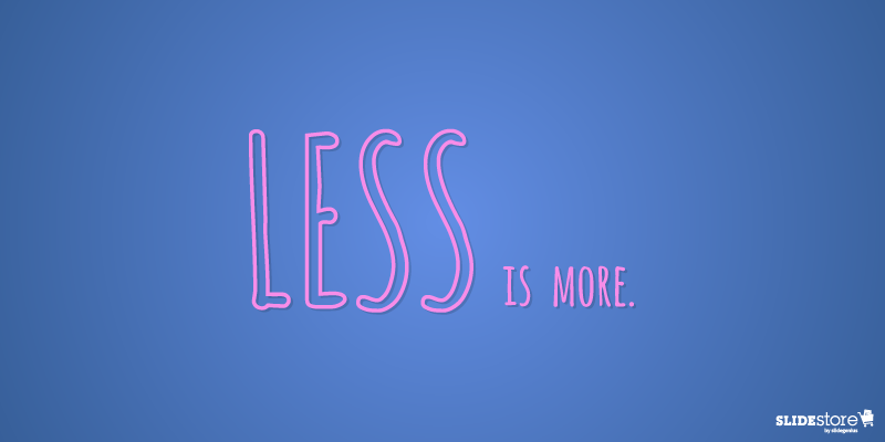
In the age of digital media, first impressions matter so much more than ever before. To imprint a good brand image on the mind of your audience, you should master the art of simplicity and minimalism. By using white space liberally and masterfully, you can lend finesse and elegance to your PowerPoint deck. Just take Apple and Starbucks for example. These brands glorify the “less is more” principle, and as a result, their products are considered as the paragon of luxury and sophistication.
On the other hand, less effective presentations tend to cram a hodgepodge of things into one tight space. Too many elements clashing with one another tends to cheapen a slide deck’s overall look. Remember, a tidy and uncluttered space looks more impressive than a heavily packed one. Give your content some breathing space and let it speak for itself.
4. Strikes a balance between texts and images
While the lack of white space results to confusion, an excess of it gives off the impression of incompleteness. Be mindful of how you apply white space lest you look incompetent by under- or overusing it. Aim to strike a balance between the different elements in your presentation design. Keep in mind what Mads Soegaard, the editor-in-chief in The Interaction Design Foundation, said, “White space is a great tool to balance design elements and better organize content to improve the visual communication experience…. For that, the white space is the real star of the show, working between the words and the pictures. It keeps each page from looking busy.”
So, there you have it—everything you need to know to care about white space. Now equipped with such knowledge, you shouldn’t look at this design element as “empty space” anymore. Your improved understanding of the role of white space in presentation design should allow you to put it into better use. Remember, the things you leave out are just as important as those you use.
Resources:
Cao, Jerry, et al. “Why White Space is Crucial to UX Design.” Fast Company Design. May 28, 2015. www.fastcodesign.com/3046656/why-white-space-is-crucial-to-ux-design
Lana, Michelle. “Why Whitespace Is So Important in Web Design.” Segue Technologies. September 10, 2015. www.seguetech.com/whitespace-web-design
Soegaard, Mads. “The Power of White Space.” Interaction Design Foundation. n.d. www.interaction-design.org/literature/article/the-power-of-white-space
Turnbull, Connor. “Using White Space (or Negative Space) in Your Designs.” Envato Tuts Plus. July 19, 2011. webdesign.tutsplus.com/articles/using-white-space-or-negative-space-in-your-designs–webdesign-3401
“White Space in Graphic Design, and Why It’s Important.” Printwand. n.d. www.printwand.com/blog/white-space-in-graphic-design-and-why-its-important


