Tag - Presentation Design

A graphic with the text "Presentation Slide NO-NO'S That You Can Fix." It features a blueprint of a house, accompanied by tools like a hammer, screwdriver, ruler, wrench, glasses, pencil, and eraser. The background shows a faint, technical drawing pattern.

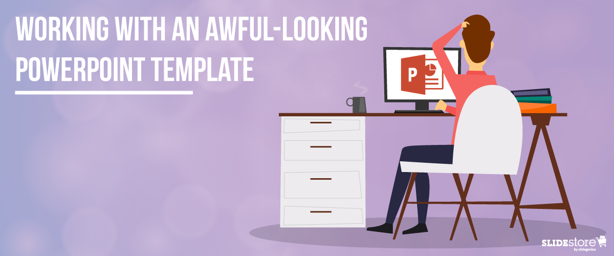
Presentation Design No-No’s That You Can Fix

The way presenters design their pitches has evolved. As Microsoft PowerPoint launches new features that boast of contemporary design and high-end technology, users become more aggressive and innovative in creating their slides. Pitches have become more promising, ultimately helping businesses attain their goals. Despite the progression, some presenters still fail to provide a visually-appealing pitch that can entice their audiences. Ugly typefaces, tacky transitions, and pixelated images continue to surface, making a presentation look horrible, or worse, unprofessional. Fortunately, with a [...]

A red banner with the text "Stock Photography and How It Can Ruin Presentation Design" in white. Below, a clothesline holds five blank Polaroid frames hanging from clothespins. The SlideStore logo is at the bottom right corner, perfect for your next PowerPoint slide.

Stock Photography and How It Can Ruin Presentation Design

Look around you. You’re bound to see a picture or ten. It’s amazing how images have permeated the collective mind. But in hindsight, they have always had the power to do so. Historically, cave paintings served as the first method of documentation. Ancient Egyptian hieroglyphics were mostly drawn or carved. One could even say that everything you see is an image, scientifically speaking. With that much influence, it’s no wonder that pictures have spread far and deep into the collective [...]

Green circular gauge showing the number 25 on the left side connected to pipes. To the right, a white rectangular box with three smaller gauges on top displays the text "Important Design Elements for Designers" in bold teal font, perfect for enhancing your PowerPoint slide or presentation slide.

25 Important Design Elements for Designers

Every industry has its own set of jargons—even design. While having a so-called “eye for design” can help you go a long way, it’s not enough to cut the mustard. There are still some basic principles to follow and adhere to in order to achieve a certain credibility in the field. Before you can become a master of design, there are fundamental principles that you need to learn first. Design is as much a skill as a raw talent, [...]

Illustration of a bearded man wearing glasses and a suit standing behind a wooden podium with houses in the background. The text above him reads "5 Ways PowerPoint Presentation Slides Can Improve Business Leads." The image is branded with the logo "SLIDESTORE.

5 Ways PowerPoint Presentations Can Improve Business Leads

When someone says the word “marketing,” the initial thoughts that come to people’s minds are sales talking, customer service, advertising, and/or social media and blog posts, or any combination thereof. It may not be wrong, but surely the concept has deeper roots than just getting a “come on” for people to trade their hard-earned cash for a product or a service. For the better business-minded people out there, the focus of the game has shifted to customer experience, the concept [...]

3 Questions to Answer Before Picking Fonts for Your Presentation

Choosing the Right Fonts for Your Presentation

Back in the day, when a global connectivity system, computers, and all these technological advancements were decades, even centuries, away from being invented, no one had the trouble of choosing what font to use for their works. Everything that people had—some without much choice—were their hands and what amounted to pens. Getting something on paper was all manual labor, and how readable manuscripts were depended not only on the conventions and foundations of the language but also on how [...]

Cartoon of a person sitting at a desk looking frustrated at a computer screen displaying the PowerPoint slide logo. Text on the image says, "WORKING WITH AN AWFUL-LOOKING POWERPOINT TEMPLATE." The Slidestore logo is at the bottom right corner.

Working with an Awful-Looking PowerPoint Template

Corporate PowerPoint templates are notorious for their impracticality and ineffectiveness. This is because they’re usually created by people with limited knowledge or experience in design. If you are guilty of this sin, then you should hire a slide design professional who can amp up your template’s look and feel. The aesthetics of your presentation can reflect the amount of dedication you put in it, so make sure you create a template that is engaging and attractive. The general goals of [...]

Two laptops against an orange radial background display animated slides. The text in between reads, "3 Ways Animation Can Make or Break Your Presentation Slide." The image is branded with the "SLIDESTORE" logo in the bottom right corner.

3 Ways Animation Can Make or Break Your Presentation

Ever since the birth of Microsoft PowerPoint, presentations have taken a turn for the better: user-friendly interface, easy-to-use buttons, and simple settings to name a few, rendering the whole task of creating presentations simpler and less time-consuming. Best of all is how the software gives you extras and bonuses to liven up to your slides with a few clicks and adjustments. Like the other elements of a visual aid, and especially with PowerPoint, animations can mean the difference between bland [...]